Curb appeal isn’t just about looks; it’s a quiet way your home shows its worth and personality.
The right outside paint can make your home more charming, while the wrong one can accidentally shout “old.”
Ronnie Glomb, a Licensed Real Estate Salesperson, says: “Painting your home isn’t just about putting on a new color; it’s about carefully choosing colors that go well with your home’s style, the neighborhood, and your own taste.” Famous color expert, Maria Killam, agrees and says it’s important to try out colors first: “Always sample a few shades before committing to a color. The way a color appears on a small swatch can drastically differ on a larger scale.”
So, before you pick up that paintbrush, here are the Exterior Paint Colors you might want to avoid!
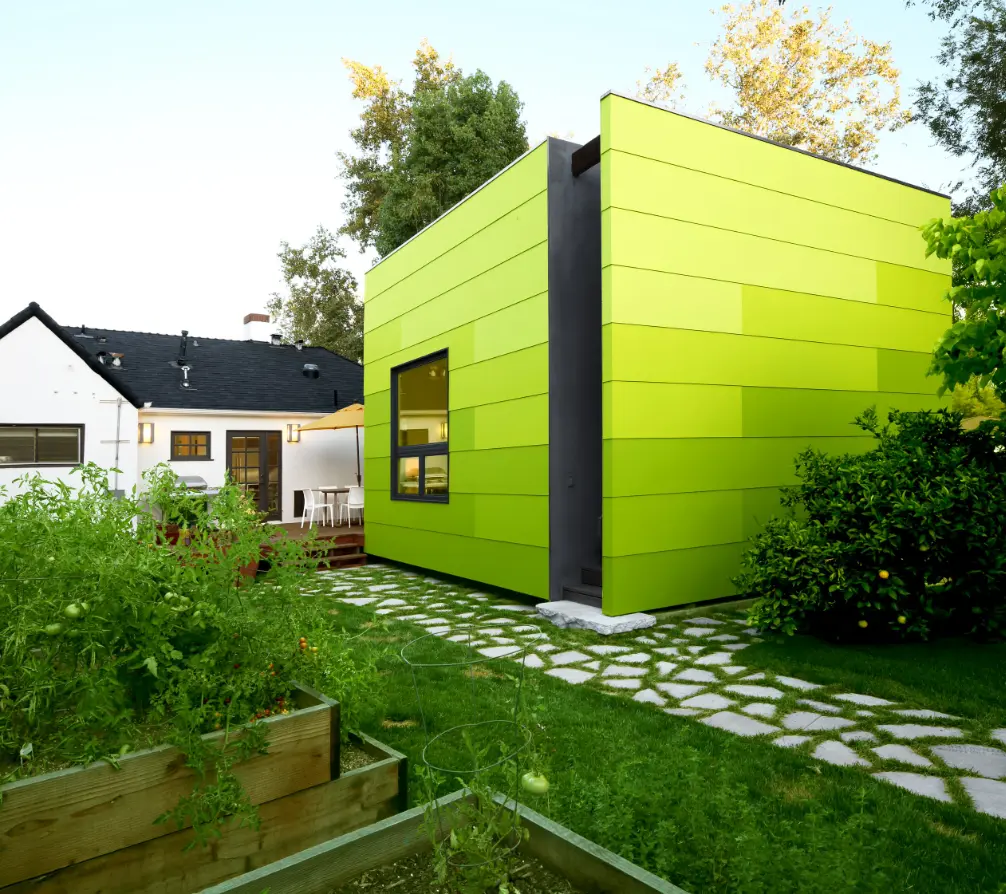
1) Avocado Green

Avocado green was a very popular color in the 1970s. Back then, it was thought to be stylish and modern.
Today, however, it looks very outdated and doesn’t match well with modern design trends.
“Avocado green is like a time capsule of the 70s,” says Miles Redd. “It can be a bit overwhelming and overshadow the architectural details of a home.”

The issue with avocado green is not just its old-fashioned look but also its strong, overpowering nature. “It’s a very bold color that can easily overwhelm a home’s exterior,” he says. “It tends to overshadow architectural details and create a somewhat heavy, oppressive feel.”
Instead of making your home look better, avocado green can actually make it less appealing.
But if you love green, there are many modern shades too that offer a fresh, updated look.
Sage green, for example, is a much softer and more muted shade that can create a calming and welcoming atmosphere.

It also pairs well with a wider range of colors and styles, making it a more versatile choice than avocado green.
Unlike avocado green, sage green is less likely to overwhelm a space. “It’s a more subdued hue that allows architectural details to shine,” says Kelly Wearstle. “It also has a way of making a home feel more spacious and airy, which is always a desirable quality.”
2) Golden Harvest

Golden harvest, a blend of yellow and gold, was once a popular choice for exteriors, particularly during the Victorian era and again in the mid-20th century.
However, its appeal has waned in recent years and now Golden harvest can feel washed out.
According to Blumberg, what once was a go-to neutral now feels bland and “fails to offer the crisp, clean look many homeowners seek today.”
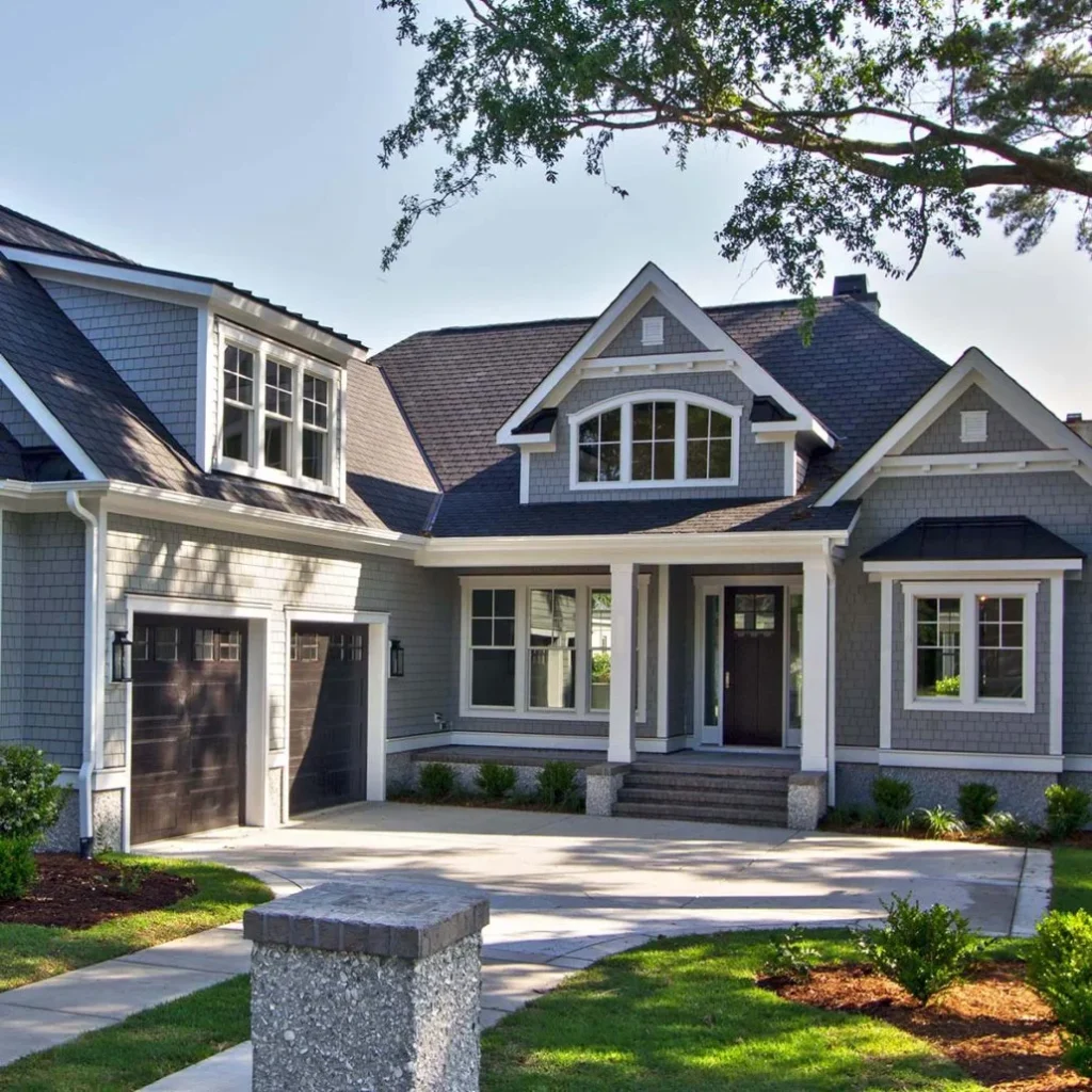
If you’re drawn to neutral tones, consider contemporary options that offer a more sophisticated and timeless look.
Warm grays, for example, add a touch of elegance and can pair well with a variety of accent colors.

Benjamin Moore’s ‘Agreeable Gray’ is a popular choice that strikes a perfect balance between warmth and coolness.
For a brighter exterior, creamy whites like Sherwin Williams’s ‘Snowbound’ can create a clean and airy feel.
These neutral colors provide a perfect backdrop for highlighting your home’s architectural features, such as contrasting shutters, a bold front door, or pops of color in your landscaping.
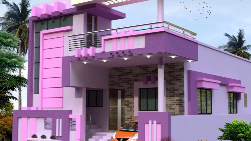
3) Mauve

Although beautiful for interior projects, mauve doesn’t do too well on the exterior of homes.
“I recently remember one property having a mauve exterior and staying on the market long after similar homes with more contemporary color palettes had moved,” Saddat Abid explained. “Mauve can make a home look tired and does not convey the sharp, clean look buyers are looking for today.”
Opt for a more vibrant and enduring color like a deep navy blue, which conveys a sense of sophistication and modern flair.

